My poster design
My word i had given to was responsibility. And I had to explain the why instead of the what. And I'm not going to lie but it was very hard.
Just the way you have to present is kind of scary and thats all I have to say .
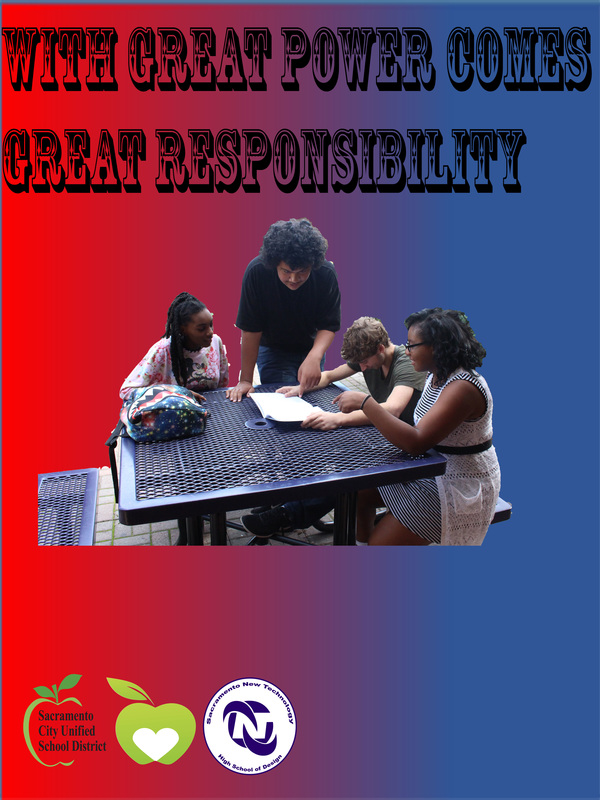
I thought if I made people seems like they are helping that boy josh looking at the book. It will make them responsible for taking care of someone who don't know what they're suppose to do.
I know its not edgy but like the target audience I thought that responsibility is very important to everyone .
My groups designs was better then my design poster. Like they were organized and I wasn't .
I wanted people to walk past my poster and say man this is pretty cool and think about how those three people were helping that boy looking down at his book. And it would motivate the kids to do it .
Just the way you have to present is kind of scary and thats all I have to say .
I thought if I made people seems like they are helping that boy josh looking at the book. It will make them responsible for taking care of someone who don't know what they're suppose to do.
I know its not edgy but like the target audience I thought that responsibility is very important to everyone .
My groups designs was better then my design poster. Like they were organized and I wasn't .
I wanted people to walk past my poster and say man this is pretty cool and think about how those three people were helping that boy looking down at his book. And it would motivate the kids to do it .
The pattern assignment
This pattern is original out of stars and theres another pattern but I colored it yellow so it looks way different and I was going to put it onto my weebly page but it looks to much too me. So my pattern you how the pattern looks pointy a little bit well I made star and I shrink it so you see one outside then I do another one inside and the reason why I did a slideshow to show you guys what I mean about how different thats why but yeah I like anyway so yeah. I think the best pattern I could definitely work with is Tongan patterns when it come to Tongan pattern I feel so creative. Ooh I almost forgot I put some of the Tongan patterns for example to show you what I mean.
The poster v1 assignment
The way I thought of this was really funny because I was really in a hurry. I know the best but I tried and that's what matter's ohh and I just remembered the text I choose is what I realized in a team I play in were call the west campus warrior but its dub c for short and yeah thank you.
The animation assignment
The animation assignment is probably the coolest assignment i've did so far. The reason is because you can use anything for animation and you have to be creative and. I like the way we have to use our creativity and it cool.
The fast shutter assignment
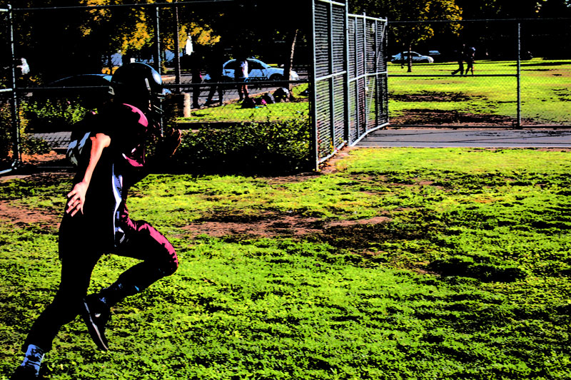
The fast shutter wasn't that hard to be honest I kind of finished it no sweat. But just how I had to upload was pretty hard because I kept putting something before the jpeg and. My files won't open so I kind of struggled but I got through it and so yeah.
The 4 way face
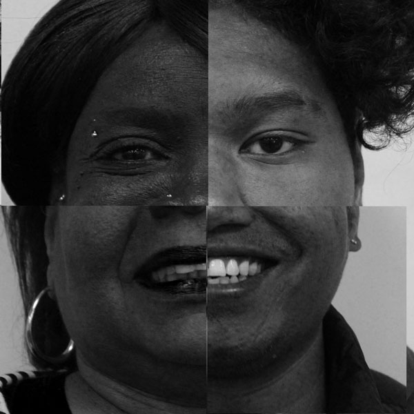
Okay the four face assignment i'm not going to lie I was kind of scared of this. Because on one side it look's like a a joker and on the other side it looked like half cat women and something I don't know like something random but yeah to me it's working progress.
The object assignment
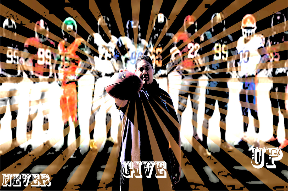
So my object photo. Well as you can see m background is on the field. And the reason why is because mr means pretend to award me a trophy. So I could do it and once mr means gave it to me. I knew straight away what was going to do. It's easy I play football and i've have a trophy in my hand. Football, trophy . now I don't know what you guys think but to me football and trophy matches so I ended up taking the photo on a field. And I add some adjustment to it like more contrast and add more green to it so it would look more alive.
Leading lines animation
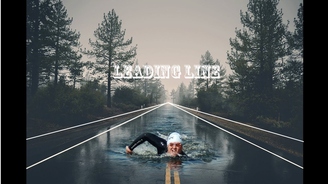
This is a leading line animation. I think this picture is really cool to me because you have the the guy in the picture swimming in the middle and the leading line is showing really well and just the picture it's self is pretty cool.
Double Exposure V1
My double exposure picture. The reason why I wanted my background to look like this is because as you can see I covered myself with an amazing picture background so you see the picture all over me I couldn't explain how cool it looked so instead of a single image I made a two pic slide show and when I say pic to me it means picture and my background thanks to mr means he helped me with the style of background and the color I choose I tried to match the color's and I did good .
humanoid made from type assignment
Now here's my humanoid and guess what it's all made from type if you don't know what type is it is a picture made with letter's or dot's and those stuff and yeah I tried my best. The background I use was colorful grunge texture 9 and i know its not the best robot or humanoid but making this I was kinda proud of myself. Oh and i couldn't really explain what it looks like and how cool it is so I thew it in there so you could see it. And because means said to do it. Hahah
Portrait with texture on blending mode assignment
So here's my edit portrait with texture on blending mode right as you can see i've made a slide show to show you the difference of those photo's and its only two pics so yeah notice how one side of my face is lighter and the other side of my face is a littler darkened and so I like the way that I leveled the dark from the light . you see my t-shirt it wasn't that color that it is right now its black and white and yeah thank.
Creating animated gif and cinema graphs
Hello again so my animated gif cinema graph. I'm not gonna lie it was pretty hard but yeah I got though it because mr means. First we had to think of a quote or a saying to get it down then. I kinda made the background different then others because you know I kinda like to be more different to everyone else and yeah thanks.
The name light writing assignment

This photo basically it what my last slide said its how had to pick a letter a number your name and a word that you think that is worthy to be written with light and I picked food because I like food and I felt like doing it too so yeah thanks
The light write assignment


The photo that I did was kinda hard to do because when you start doing the photo it has to be in the dark because if it is in the light it will brighten the photo but u your aim is to darken the background so only the light writing shows we got given a number a word and we did our names for the light writing and this is the result.
The bokeh portrait assignment
So when I took this photo it was lighter and the side's were a little bit bright and revealing but I cropped it and I fixed my face a little bit because if you at my face half of it was dark and the other half was more bright so I darken the left side of my face it looked like there was light but really there was no light I'm pretty shocked my self too because everything was suppose to be dark but some how it ended up dark on one side and bright on one side and yeah.
Creating a duo tone Assignment
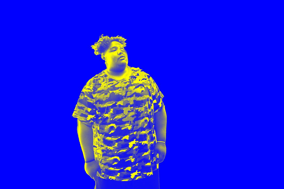
So duo tone. The colors were the hardest bit for me to do because i'm use to using more than one color. Like for instants blue red and white purple and yellow you know and duo tone was really new to me. But yeah I tried and even doe I was i'm an total amateur at duo tone I reckon I did alright you guys see the I crop myself out of the background I was in . So I can put a background that would match my background and the color that I put myself in.
The sandwich bag Assignment
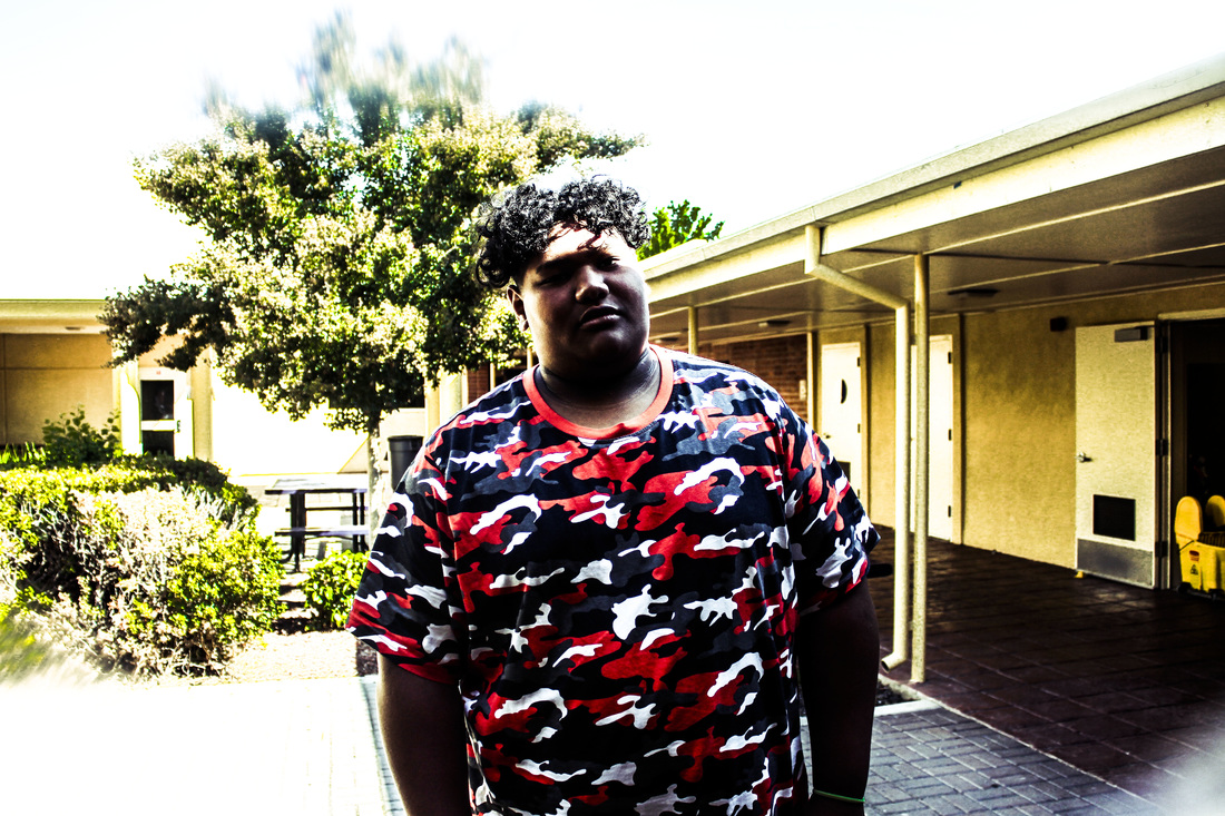
The photo that I did was pretty impressive because its my fist time doing this kind of photography and i kinda killed it. The photo I took was not really good but I though I could fix it. So I did but the thing is my face wasn't showing enough and it was dark and a little bit too bright around the background. So what I did was I brighten the color on my t-shirt so you can see that the red is really brighten and the tree's behind me i brighten those up too. you see how that soft blurry texture around the background. I played with the color's a bit to make my picture stand out.
GREEN SCREEN PHOTO ASSIGNMENT
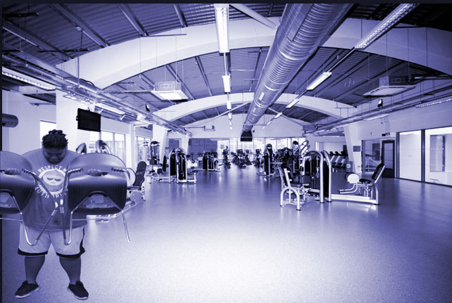
So when I did this photo I though if you guys would see my photo when I did no tinting at all. You could see how the the photo did not fit in it just wasn't fitting in. So I tinted the photo so it could fit in and I try to not make me stand out that much because it a green screen photo and i'm not trying to make me stand out i'm trying to make the whole thing stand out. And I tried make it like from a distance it looks pretty real.
